Sooo, I know we don't have to post anymore, because grades are in, we are all graduated, and finished with our bfa show. And probably no one bothers reading this anymore.
But I do hate leaving things open-ended, and I wanted to share the final product.
First of all, graduated. Yay! Got great grades, graduated with honors, and generally felt awesome.
BFA show went great, lots of people loved my posters, had one person interested in buying copies, and generally had a great time (after all the stress of setting up).
Here are the final posters. In order of eras.
They got printed on a lovely thick textured paper that had many people thinking they were actually silkscreened, which was totally the effect I was going for. I need to get pictures of the printed posters.
Here's me (and my set-up, including process book and 30-seconds-turned-3-minutes spot) at the BFA show opening reception. :)
I’m exploring Mexico’s graphic design history in order to find a style of design, different from what I have been taught, that informs my personal identity and includes my Mexican heritage. I would like to develop my own unique style, informed by modern design, but influenced by the designers of my Mexican past.
Wednesday, May 16, 2012
Sunday, May 6, 2012
A bit of installation
My wall is bluuuuuueee! But I'm getting nervous about handpainting my letters for the title... But.. it is essential. Excited to finish my papel picado, I think it will add a nice touch. :)
List of things I need:
power drill
level
yardstick/measuring stick
pencil
3-prong extension cord
white tape to hide the cord
a screw for my postcard holder
Natalia says I have to slow down my animation.. which means I need to go into aftereffects, re-render that clip after edits, put it back into imovie, tweak the music bits, and then export again. Sigh! But I know she's right.
Thursday, May 3, 2012
An oops
And, holy hell, my process book is wrong. My mistake, I feel like an idiot, bit I guess I will just try to order another for the show.
EDIT: But, in some better news, my little animation guy is exporting nicely from imovie. I chopped it up in to two parts so it's not quite such a monstrosity, and the first half has already finished and the run through looked nice. Sure, it could use some polishing, but in this point in the game, I just want it done! Second half is exporting now, and I'll let it run while I go to bed. 2 hour export sounds a lot better than aftereffect's 24 hour render. Yikes.
Also ordered two new versions of a properly formatted process book. Decided to just eat the cost there. Hopefully it will come as quickly as this one did. If not, no biggie. I don't reeeeaally want to show it in the show anyhoo.
Wednesday, May 2, 2012
A few errands
Went out and did BFA errands today. Picked up clear display options for my business cards and postcards, as well as a velcro adhesives to hang up my posters. I decided I couldn't stomach the idea of alligator clips. Too... crass. Also picked up a gallon (!) of my paint. That may be, actually probably will be too much, but I wanted to be safe rather than sorry!
Still trying to figure out a way to make my display shelf for my process book... I was going to have my grandpa help me build it, since he loves making things with wood, but I think my Mom's concerned with the time constraint and the fact that he likes to build things that last. I just need a lightweight, cheapy option to display my book that I can mount to the wall.
I've been investigating products online, but all I've found is things for display in retail stores that hook onto walls, and I need something that will screw on. So this leaves me.. with the option of not displaying my book, or building the shelf myself out of materials I pick... I'm thinking cheapy chipboard or something like that. I can see how it would go in my head, I'm just apprehensive since I'm not so great with constructing things.
Tomorrow I go in to school to work (and hopefully finish) my animation thinger from 9-2. Then my last class ever is from 2:30-4. Sad! Friday off, then Saturday apparently I'm spending all day painting, and Sunday I think I get to paint my own walls, and then the week of set up starts! Woo!
Tuesday, May 1, 2012
A lovely tuesday
So I literally sent my process books to be printed by lulu last night at 5-6ish pst or 8-9ish est. I just got an email saying they had already shipped! They're currently in New York and should be here on Thursday! How awesome is that?
Also got a crash course in after effects from barb today so I could produce my 30 second spot. Worked hard on that, should be done tomorrow or thursday. And its definitely not 30 seconds. Its looking to be 3 minutes 37 seconds. That's fine with me; it will be less annoying of a loop.
Sending my posters out to print tonight, after I went to check out the printer's paper. Picked out a nice super textured heavy paper. It should be awesome.
Also claimed my pedestal today; good thing I got there right at 2 cause there were only like 10 pedestals in the gallery and people were claiming multiple ones. I got one that I think will work fine, and Eric said they provide us with the means to secure the iMac to a pedestal. Cool. Also got Cable's sign off for the paint.
Everything's falling into place!
Monday, April 30, 2012
A little close for comfort...
Process book ordered! I got three saddle-stitched, and one perfect bound, just to see how it'll look. One for Natalia, one for Marina, one for the show, and one for me.
Now hopefully everything will go good with the animation tomorrow, and then I will also go visit the Bellevue Fine Prints place tomorrow on the way to pilates. Check out their paper, talk to them about their ridiculous policy of we only do (whole??) inches, and make sure it will be all on track for printing by Monday.
My process book should be here on next Thursday at the very latest. Need to get my paint, but will talk to Cable tomorrow and get his signature.
A productive monday
Process book okayed, posters okayed, exhibition space okayed, and got Natalia's and Julie's signature... now I just need to find Cable.
Feeling pretty good.
The animation will go down tomorrow. And then I will have no more production! Cool.
Feeling pretty good.
The animation will go down tomorrow. And then I will have no more production! Cool.
Sunday, April 29, 2012
A cozy spot on the couch
Finished my process book tonight. Thanks goodness I did, it pointed out a few holes to me, including needing to scan my branding sketches and realizing I never added my symbol to the fifth poster! Aaarg! Terrible oversight there.
So hopefully I can get Natalia to do a walk-thru on it tomorrow, and then order it expedited through lulu. Not a big deal if it's late I guess, I don't really think it's necessary to add to my exhibition... and the last time I did a process book I liked, I was told it was badly designed by my teacher... so hopefully this one will go over a little better. But I'm still having Natalia check it out.
So tomorrow, scanning, polishing and printing B+W proof of process, and we're good! Oh, and adding the symbol. Cause I'm too tired to do it tonight. Whew.
I did finish two out of three of my humanities papers. Not bad! I just have to pick a movie to write about for the last one, and I should be geeeewwd.
Friday, April 27, 2012
A look into the weekend
Uuuh.. I need to take this weekend to work on my three humanities papers I have to turn in next week.
So hopefully things are going to be okay with my posters. Poster 5 needs to sit a few hours.. before I can decide what to do with it. I've been looking at it too much.
My postcards came, they look nice, I guess. I need to find where I stashed my business cards.
Need to buy my paint, after I get approval from Cable-annoying-face.
Need to figure out my statement... Julie was completely confusing today: "Your statement should be 1 sentence or two.. or a paragraph.. or two" uuuuuh-huh.
I think I need to reconfigure my gallery space... feeling cramped and I still don't have enough room for everything.
Signed up for gallery sitting and set-up task (painting).. gallery sounds like the most boring thing on the entire planet... but as long as I only have to waste five hours once... And Julie seems to think it will be 9-5 on Saturday for painting set-up? If it takes that long, I am seriously walking out of there. That is ridiculous. 9-12 is more reasonable.
Ugh.. today just kind of sucked... suckage was amplified by lack of food.. makes me crabbier...
Think I will order a test run of my process book while lulu still has the sale on.. won't make any difference, but it will be good to have multiple copies.
An ambivalent feeling
Sooooooo first rough done of poster 5.
I'm....... not sure I like it... there's parts that I like, but I'm kind of frustrated with trying to balance the simplicity of art deco style with the complicated intricate details in the ancient Mayan style.
But, I've worked for a few hours, and I need a break! So, time to pack up and go home, then eat lunch. Yum!
Wednesday, April 25, 2012
A wednesday morning
Aaaah, let's see.
This morning went through my pictures of my Mexico trip to see what I had from the Palacio de Bellas Artes, whose interior was very art deco-y, since that's the theme for poster 5: art deco and architecture.
I plan on doing something very simple and stylized, with a hazy feeling, including gradients. I see in very clearly in my head, but I will have to see if I can execute it. During my research I found this book that could prove useful: The Mayan Revival Style: Art Deco Mayan Fantasy. I discovered that Mexico's art deco movement, which would often incorporate indigenous elements, actually inspired architects outside the country, most prominently in the US, even Frank Lloyd Wright. This book is at the Seattle Public Library... which I don't have a library card for, but I figure I can stop in on my way to school and see if I can just sign up for one and pick up that book.
So I'm thinking my sentence for Poster 5 will be something like:
Mexico’s design often took influence from international sources, but was reinterpreted with
Mexican themes.
I feel like that's not doing justice to the fact that it was actually Mexican design that influenced other countries for once, but I can't really have a longer sentence than that.
Also worked on my process book... which just about wants to shut my computer down, because it's so image-heavy... eek. Plan to have that done by Monday, and order it Monday night with expedited shipping.
Also, my postcards have shipped. Yay! Should be here by the end of this week or the beginning of next. Need to dig up my business cards...
Tuesday, April 24, 2012
A bit behind schedule
And now I am late. Bah.
I should really be starting on the three papers I have left to do for my humanities class... Only like a week to do them in.. Ooops.
Monday, April 23, 2012
A bit of slow progress
Ugh. I didn't get as far as I wanted, and Natalia bailed on us, so all of that kind of sucked.
But, I will have tomorrow morning to finish poster 4, and that will be that!
Here's as far as I've gotten today:
I've gotten all the text done, and tweaked to look better, and I just have the illustration left to ink. I think it looks pretty cool. Hopefully other people do too. I'm thinking of a red "background" behind this image, since the original was actually printed on red paper to give it "two" colors. I don't want to have one poster's paper different from the rest, so I just wanted to simulate it. Hmmm.. red... green.. blue.. yellow.. brown.. Will have to try some colors out, see what I like.
Also will have to add in my symbol, I think knocked-out on the wrist area.
Okay, time to go home and enjoy some sun!
Sunday, April 22, 2012
A bright warm sunday morning
Finished hand-lettering the type on poster 4. I think it looks pretty cool, but I don't know if Natalia and Marina will like it. Hopefully.
Today I will go over the illustration, then Monday they will both be scanned and pieced together, and traced (inked) in Illustrator, then BAM! Poster 4 is done.
I'm a little intimidated by Poster 5, since I only have an extremely vague notion of what it's going to about and look like, but I need to get it done, like, yesterday.
Although I found out that the Bellevue Fine Prints place has a turn-around time of like 2-3 days, so that's good. Gives me a little more breathing room. But I need to finish them in order to send the process book off to print, soooo... yeah. Definitely doing expedited lulu shipping.
I am soooooooo excited to almost be done. I like my posters. I hope other people do too..
Friday, April 20, 2012
A few postcards anyone?
Okay, so went ahead and ordered my postcards from moo... They have a 25% off sale til the 22nd, and then I got an additional 15%, so that was pretty cool. I only got 300.. hopefully that's enough. I'm not very good when it comes to guestimating for these things.
Also, I'm assuming I may still have small tweaks to the first three posters after Natalia sees them, buuuuut I wanted them on the cards, so there they are, even if it isn't a final version.
They're due to be in May 2nd. That makes me feel like I need to get my process book and posters ordered, like, yesterday. Panic moooode!
A little bit farther
Uuuuum, been working on my poster 4, hand-doing the type, title is set and working on my sentence. Then I have to add in the illustration, which I've already picked, and scan and ink it.
Then on to poster 5! So close. :)
Looking at ordering postcards from moo.com... It's a little pricier, but I like the option of having different images for the cards, instead of one set one.
So, yes.
Then on to poster 5! So close. :)
Looking at ordering postcards from moo.com... It's a little pricier, but I like the option of having different images for the cards, instead of one set one.
So, yes.
Wednesday, April 18, 2012
A morning of process book
Finished my process book up to 11th week reviews! Took a little longer than I wanted, but that's that!
Time for a well-deserved break for lunch and then back to work, this time on posters!
Oh Natalia, why must you be gone a whole week in the month before our BFA is to be completed?
Time for a well-deserved break for lunch and then back to work, this time on posters!
Oh Natalia, why must you be gone a whole week in the month before our BFA is to be completed?
Monday, April 16, 2012
A bit of progress
Well, I got up to 5th week reviews, that's got to count for something.
Now I am tired of this, so I will break for tonight.
I expect to have lots of time to work tomorrow, maybe I'll keep working on process book, or transition on to posters. Eventually my process book will require that I finish the posters anyway, soooo...
Now I am tired of this, so I will break for tonight.
I expect to have lots of time to work tomorrow, maybe I'll keep working on process book, or transition on to posters. Eventually my process book will require that I finish the posters anyway, soooo...
A process book started
Okay, so process book is looking something like 52 pages, could go a little higher. I have 1-16 pretty much done, and the rest is planned out, so I know what's going where. Most of it should be images, so I just have to drag and drop.
That shouldn't take too long.
Time for my get-in-shape-for-the-wedding-workout, and then I will be back to work on the process book up through 11th week reviews.
Tonight, hopefully, I can come up with some ideas for poster 4.
Also, this blog is only coming in handy for me to know what the heck I was doing in earlier months... but I could have made that up too. Mostly, it's useless, because I talk much too casually to copy and paste my text into my process book!
Sunday, April 15, 2012
A post-dinner post
Uuuh.. so much for work this weekend.
But I do plan on getting both final posters at least finalized to show Natalia, and a good jump on my process book, by the end of this week.
That will be good, yes?
But I do plan on getting both final posters at least finalized to show Natalia, and a good jump on my process book, by the end of this week.
That will be good, yes?
Friday, April 13, 2012
A moment
That moment in which you realize that all the cool effects you are applying in Illustrator to make your poster look old timey and inked are really just making it look like crap.
Oops!
Oops!
Thursday, April 12, 2012
An updated poster 3
Well, here's a mostly completed poster 3.
I changed the frame, inked and colored my skelegirl, and incorporated my "movement" hieroglyph cleverly into the frame, although I'm not sure that's... valid.
The text is still there as kind of a placeholder, since Natalia wanted me to hand-draw it.
I just want to move on and make edits to other posters before I do that.
My toes are cold.
A couple dreams
I need to stop having anxiety dreams about BFA. These past two nights I've been dreaming like I've been in some action flic, the bad guy's chasing me and I just want to finish my projects! And I keep doing things in my dreams that are on my to-do list, and then I am soooo bummed when I wake up and they haven't been done yet!
Gah!
Gah!
Wednesday, April 11, 2012
A petty whine
I know this is just going be a whine, so please ignore.
I am just e x t r e m e l y f r u s t r a t e d because I finished my internship last week, which I figured would free up three mornings that I could come in to school instead and work on stuff. Instead, we have lost our doggie day care and I end up staying at home and looking after them, which means I get no work done. Technically it's my own fault, I should stop sleeping in, stop watching so much tv, take the pups for shorter walks, and just get down to business. But I do work so much better at school.
So. I have been cranky this week. Hopefully we can resolve this somehow...
In BFA project news,
- I have found a better symbol than the scales, thanks to my advisor. She suggested the "movement" hieroglyph from one of the indigenous languages. Natalia approves.
- Started linework and coloring on Poster 3. Will finish that up, add in my new symbol, and hand-draw the type, as well as adjust the border.
- Fix symbol on poster 1
- Dirty up border on poster 2
- Add in symbol in poster 2
- Fix type in poster 2?
- Come up with posters 4 & 5
Monday, April 9, 2012
A disappointment on monday...
Gosh, I got next to nothing done on my list. Geez.
Will have to put in a few hours at home!
Sunday, April 8, 2012
A happy easter
Well, I transferred my process book layouts over to an appropriate lulu/blurb size today, and then just now went through and tweaked it, adding paragraph styles, etc. Most importantly, I ditched a really ugly font that was really tying it down, and I do feel better now. I have this guilty feeling that I should only be using Mexican-designed fonts, but it's not like they're widely available and certainly not free, so I'm just relying on old-style fonts such as Garamond and Eames, with a fun twist in Lavanderia:
I probably really should take a look at book layouts in the early twentieth century if I want a design resource for this stupid process book, but I'm not quite sure where to look. Will have to ask Natalia tomorrow.
On the docket tomorrow:
Oh yes... will have to look into cobalt blue paint. That will be a bitch to paint over again.
I probably really should take a look at book layouts in the early twentieth century if I want a design resource for this stupid process book, but I'm not quite sure where to look. Will have to ask Natalia tomorrow.
On the docket tomorrow:
- email Marina a thank you for 11th week reviews, plus a recap of her comments to confirm
- email Tai from internship a thank you for my gifts :)
- keep plugging away at process book
- make (known) edits to posters
- talk to Natalia about old book design, and the scale idea
- print out current version of process book to see how type looks/reads
- uuuuh figure out posters 4 & 5.. quickly!
Oh yes... will have to look into cobalt blue paint. That will be a bitch to paint over again.
A look back at my process book
Well, Nancy freaked me out enough that I've decided to dig up the process book I made at the end of last semester and determine what needs to get done to complete it.
I'm not... entirely pleased with the style of it, but I'm really not feeling like I want to change it all that much. I went through and found some places to publish it... lulu, blurb, mypublisher... All of those will have to be rush shipments, I won't be finishing my posters by next week, eek.
I had originally planned to get it printed somewhere local, however, I haven't looked into that at all.
I think making a process book is slightly silly--no one's going to sit there and read it during the BFA show. Sigh. I don't feel like it is showcasing any of my design talent, in fact, I feel like it kind of looks like crap, but not sure how to fix it.
So I guess I'll just get in the content in there, as much as I can, and leave it at that. I have posters to work on, after all.
Thursday, April 5, 2012
A relaxing weekend in my sights
Well, thank god that's over. It went really well, and left me feeling full of hope and excited for the BFA show, which was a much better feeling than the kind of dejected feeling I had after 5th week reviews.
Here's the notes I jotted down afterwards:
I had a table full of resources, and two tables full of papers for each poster (inspirations and sketches) and then put up my three posters that I finished, tile-printed, plus the inspiration boards for all five posters.
Here's my third poster that you haven't seen yet!
I think it looks pretty awesome, although admittedly the secondary type still needs work.
Here's the notes I jotted down afterwards:
First poster—good
Second poster—integrate type better
Third poster—redo border, make it more nouveau-y, ink
illustration, add color, no all caps, fix the typography
Fourth poster—poem as text, add political themes, fix sentence--it was not about hand-done, but expressionism/poor-man's illustration
Fifth poster—art deco as Mexican, add music? Or
architecture—Europe + America (Chicago) reinterpreted by Mexico with Mexican themes
Sixth poster—my own, what I have learned?
I thought it was immensely interesting that Ricky was the one that suggested the sixth poster of my own work, rather than copied from others, since it was him that said there was too much of me in my first posters from the 5th week review. Yay! Made me very excited.
Marina was there, and on time, and skyped, and was very supportive and helpful and totally hit it off with Natalia (I think their shared love for design history helped connect them). So that was fantastic, since that's the thing I worried about the most. And her English was quite good. :)
![]() |
Here I am, beginning my presentation, with Natalia and Ricky, Marina via skype behind Natalia, and Tiffany out of frame to the left. |
Here's my third poster that you haven't seen yet!
I think it looks pretty awesome, although admittedly the secondary type still needs work.
Wednesday, April 4, 2012
A time for bed
In bed before 11 the night before my review.. Yay! Sleep is good.
I didn't get quite as far as I would have liked, but it is what it is. Hopefully my panel likes it.
I haven't heard from Marina confirming our skype date for tomorrow... so I'm just gonna have to pray.
Now let's see if I can quiet down all these loud thoughts in my head so that I can fall asleep!
I didn't get quite as far as I would have liked, but it is what it is. Hopefully my panel likes it.
I haven't heard from Marina confirming our skype date for tomorrow... so I'm just gonna have to pray.
Now let's see if I can quiet down all these loud thoughts in my head so that I can fall asleep!
A wednesday morning before the review
I didn't get much more work done yesterday after finishing my Posada poster, except for a little work on the art nouveau one. I found a Mucha girl that I liked, which I then turned into a skeleton. Lovely. So the main bulk of that illustration is done (if I keep it line work, which I could), I just need to put in a very simple background (in case I want to color it). Then I need to hand-draw the title "Diseno Mexico" and add in the info text at the bottom.
I just suddenly had the revelation that it's a poster about hand-done type anddddd I wasn't planning on hand-doing the info text at the bottom. Hmm. I think it makes sense that just the headlines/larger copy would be hand-done, but larger chunks of text could be type-set. At least it makes sense to me, probably because it makes it easier for me. Will have to pick a font, though; I'm not sure my Century 725 Bold Condensed will apply here.
I hope to have a very-nearly finished art nouveau poster, and a rough draft of the Estridentista/Constructivist/TGP poster for Thursday morning. That means a lot of work needs to get done in the three hours that I'm at school today. I figure I can probably make my PDF presentation tonight at home, but I want to tile-print the posters I have in final stages (intro, Posada, art nouveau) and the cropping and taping together takes time.
Today is my last day at my internship; I am sad. Even though it took time out of my schedule, I've had fun working on design that turned into real-life items! And my boss generally seemed very happy with my work. Hopefully my first job will go as well as this internship.
Tuesday, April 3, 2012
A couple poster options for poster two
My headache has finally gone away after a lot of sleeping and drugs, etc. Thank goodness. Woke up in a good mood this morning, and have been able to get some work done, which is more than I can say for the last few days. Bleh.
Here's a couple versions of poster 2:
This is the poster influenced by Posada's work. I took heavily from his style, including the border, font types, and the illustration. The layout would be... unconventional at best, so we'll just have to see what Marina says at my review. I have to decide which one to tile print.. hm.. black and white would be cheapest! Probably the Don Quijote one, although the lady being carried off is quite hilarious.
I also still need to work in my scale. But as Marina is not a fan of the scale idea at all, I might just wait til post-review. I also might change the headline to filled in rather than outline, even though that's not how the font went... but it is so weak looking right now.
So that's two posters down, three to go. I'm hoping to have two more in at least final sketch stage for Thursday morning. That means a lot of work today and tomorrow! But I have found peace leading up to my review... it's not something I feel like I need to stress about. I've worked hard, even if it's mostly been research and not 'making', and I would think it would show in my work and my thinking.
Sunday, April 1, 2012
A godsend
I've had some setbacks today, including being woken at 6:15 by my schnauzers, discovering that my headache from yesterday did not go away, taking my prescription pill for my headache, which made me pass out and lose a couple hours to a delicious nap...
But. I just had a-maz-ing success. I was looking for the font in the secondary headline text on this Posada broadside:
And used identifont to try to find it. At first it was trying to tell me it was Baskerville, which it obviously is not. So I tried it again and came up with a font called Century 725. Now I have Century but it was not the same, as the one I wanted was a bold condensed version. Now Century 725 had a bold condensed version that looked just about right, or about as close as I could hope to get. Myfonts.com wanted $25 for it, which I could have shelled over, as this posters are important enough to me to be willing to put in the extra moola.
But a simple search for the font came up with a link to a free download of the exact version I needed, Bold Condensed.
Someone up there is looking down on me! :D
I also came to the realization that since 11th week reviews are going on, I wil have both Monday and Wednesday's class time to work. Yay! I do work better at school, with an actual desk rather than a couch/kitchen table.
So today I will go out and get some double-sided tape so I can tile-print my posters on Wednesday, and on Wednesday I will put together my presentation PDF as well. Marina emailed me back this afternoon, I think I will just have to email back and clarify my position, but, well, that takes time and I have to work on posters!
Saturday, March 31, 2012
A saturday snooze
Soooo not nervous yet, but a little annoyed that I've gotten like 1% of work done today. I sat down to work on my poster, but immediately got a headache and decided it was a much better idea to fall asleep on Erick. Um, alrighty then, brain.
I'm starting production on my Posada-influenced poster, which hopefully will be mostly finished in time for 9:30 am on Thursday. I would also like to make good headway on my Art Nouveau poster, as well as the Estridentista poster. I think the Art Nouveau one will be the absolute hardest, since that requires a very strict sort of illustration style that my skills don't really measure up to. But I am sure as heck am going to try. I wanted to do my own illustration of a woman reading a book, seated, but she's a skeleton. It will be wonderful, according to the vision in my head. Now just to get it out on paper.
I also came up with a tentative sentence for the constructivist/Estridentista poster. "A renewed interest in the hand-done led to the popularity of linoleum and woodblock illustrations." I have to figure out the illustration for this one, though.
So that just leaves the Art Deco poster, for which I have no ideas for content.
I emailed Marina, and while I appreciate her advise and definitely need it for my project, I'm getting a little frustrated. She said she was too busy to respond to all of my email, and would get back to me this weekend, but said that my ideas were all over the place and out of order. Really, I want to do this right, but I have run out of time and I just need to move forward with all of this. We originally had the idea to create a matrix of images in order to be able to have a sample of general layouts and colors, etc. I figure I can do this for each era of my posters, Posada, Art Nouveau, Estridentista, Art Deco, and Indigenous influenced. Then I will feel a little more confident about what I'm doing, because I can show off my matrix for each poster and say, "I made this this way because of that."
Soooo anyway. Hopefully I will get more done tomorrow. My review is Thursday morning at 9:30 am, and Marina should be skyping in. I also found out that it will be Natalia and Rossi on my panel as well.
Thursday, March 29, 2012
A thought
I need to be starting my internship work, but I keep forgetting to post on here, and I have things to say!
I'm reading an essay by my advisor Marina, about Mexican designers in the 1990s and how they started becoming more interested in the history of design in their own country, which really hadn't be researched that much--art history and other things were considered more important to research. So Mexico didn't start studying its design history until very recently. This makes me really excited--heck, I want to move down to Mexico and join in and be part of those efforts to learn more. Too bad I think my Spanish would hold me back. :P
But in her essay, it talks about the local vs. international design, and it really interested me, just thinking about how different design would have been if we had remained in isolation. I mean, I know the rise of design was largely driven by the industrial revolution, and the technological advances that came with it, especially forms of printing... and the technology also made it so that we could travel faster/easier and that people started leaving farms and congregating in the cities... so although I know design wouldn't be what it is without the technological advances... I just imagine how extremely different each regions design aesthetic would be if they couldn't influence one another and share resources and if they took only from themselves. I feel like there would be such variety!
So exciting. Anyway. 5 minute post, back to work.
Tuesday, March 27, 2012
A morning's work
![]() |
Poster in progress |
![]() |
Finished poster, until critiques, I suppose |
I worked all morning and had fun, but I am starving so it's time for lunch!! I'm really happy with how it looks, so I'm afraid to show it to anyone cause I don't really want critiques, I want to move on to my other posters.. but I need to email it to Marina and see what she thinks.
Monday, March 26, 2012
A poster finalized
Had a nice quick check-in with Natalia today. I actually did show her my poster, with the image idea, and she liked it, so phew. That's one poster sketch "finalized." I can go ahead and start coloring it, right now I'm seeing it in black and aztec blue (cyanish) with maybe some red details.
Here's the sketch, assembled from scanned pieces:
One of my main posters was the idea that Mexican design acts as a pendulum and swings back and forth between influenced by local design or by international design. Natalia favors the idea of creating a little mark or system throughout the posters instead that would designate how much the poster is influenced by local or international design. So I've decided on the scales as a "clever" symbol only because I'm a libra and my sign is the scale. :P It will be tipped one way or another depending on the poster. But that means that I've lost one of the ideas for my posters, so I've had to hash it out in a different way.
Here's the sketch, assembled from scanned pieces:
![]() |
It will be 40x60cm, which is just under 18x24 and a little skinnier. |
I've made a list of what each poster is: the design influence, the topic it covers, and how local/international it is. I'm also trying to come up with the text that will be featured on the poster. Here's what I have so far:
Posada – color (limited to red, yellow, black, and brown
with some green and blue due to technological restrictions till the 30s-40s)
– balanced/slight international
The Mexican printer’s color palette
was restricted until the 1930s because of technical limitations.
Art Nouveau – type (wood/handdone/lino) – international
Mexican typographers favored
hand-done or wood type for much of the early twentieth century.
Art Deco – ?? – international+
??
Constructivist – treatment of image (woodblock illustrations
favored) – local-ish
Ummmm
something intelligent.
Indigenous influenced – intro poster – local++
N/A
Art deco was the one I threw in there to replace my pendulum poster, so I will have to come up with something for that. And as for the constructivist text, I need to start reading more in-depth into one of the books I brought back from Mexico, which features that style almost exclusively... and luckily it's both english and spanish text! So hopefully I can read it fast.
And that concludes todays update. I'm hoping to color the intro poster tomorrow morning in illustrator, and I need to email alphagraphics about a quote--thinking about a print run of 50 posters of each style, and I'll just try to sell the extras.
Sunday, March 25, 2012
A sunday post
I am often disappointed on the weekends as to how much work I actually get done. Especially now that my parents have gone to Argentina for 2+ weeks... I feel like there's too much to do.. dishes to clean, meals to make, animals to take care of... This all adds to my stress level, which makes my coping mechanism of sitting on the couch and doing nothing kick in.
Yesterday.. or the day before.. I had the idea for the graphic at the top of my first poster pop into my head.. it is definitely not deeply symbolic.. quite literal.. and a little too complicated.. but it's stuck in my head for a while now and it feels pretty right. It is an open book, pages turning, and from which springs a poster from one of the middle pages.. this represents how my posters are the work of lots of books. I have two other smaller posters flanking the middle one, and I'm thinking of having "arteDISEÑOhistoria" (each word) be on the posters.
I'm almost afraid to ask Natalia's opinion because she will just lament the fact that I didn't go through that Visual Communication class that Cornish has.. I transferred the credits.. and she will tell me she doesn't like it and I should come up with something else. Which, at this point, I would just like to move on. I have a lot of concepting and brainstorming to go on in my head for the other posters, because they are definitely not well defined yet, and I would like them to be in at least final sketch stage for my 11th week review.
Friday, March 23, 2012
A sleepy reluctant update
I am so tired and don't really want to update, but since my grade depends on it...
Today I emailed Marina about the topics for my posters, and the fact that I'm having problems trying to find the actual sizes of posters back in the early 1900s in Mexico. All the sizes are different, and are random numbers like 59.5 or 60.1 cm etc. She already emailed back explaining that there really wasn't a standard in place yet for paper sizes. I guess that means I can pick whatever I want? As long as they're all consistant. I was thinking 60x40cm or 23.6x15.7in seems like the best bet, and closest to what my original size of 18x24 was.
As for my poster topics:
I'm still trying to figure out an appropriate image for the top of my intro poster, which is all sketched besides that. It needs to be something flat, graphical, highly symbolic, and easy to abstract. Some ideas have been the Cornish building, the Seattle skyline, the stairs leading up to the Cornish building, or perhaps the Cornish seal rising out of an opened book with pages turning. I know I should just sketch all of them and fit them in and see what I like, but I get such satisfaction from having a sketch, and having it be done right, and finishing it up, and fine-tuning it only in small increments. Not how it's supposed to go, but I guess that's just how I work.
This weekend I plan on finishing up the intro poster, and really fleshing out how the other four are going to look. I also need to email my other advisor and keep him in the loop. Only one and a half weeks til 11th week review.
Today I emailed Marina about the topics for my posters, and the fact that I'm having problems trying to find the actual sizes of posters back in the early 1900s in Mexico. All the sizes are different, and are random numbers like 59.5 or 60.1 cm etc. She already emailed back explaining that there really wasn't a standard in place yet for paper sizes. I guess that means I can pick whatever I want? As long as they're all consistant. I was thinking 60x40cm or 23.6x15.7in seems like the best bet, and closest to what my original size of 18x24 was.
As for my poster topics:
- Intro poster/BFA promo
- Poster concerning the pendulum effect of local vs. international design influence in Mexico.
- Poster concerning the limited use of colors in posters prior to 30s/40s due to technical limitations
- Poster highlighting the type of Mexico: handdone/painted or woodtype or linoleum
- Poster showcasing the different treatments of images/illustrations, especially woodblock
I'm still trying to figure out an appropriate image for the top of my intro poster, which is all sketched besides that. It needs to be something flat, graphical, highly symbolic, and easy to abstract. Some ideas have been the Cornish building, the Seattle skyline, the stairs leading up to the Cornish building, or perhaps the Cornish seal rising out of an opened book with pages turning. I know I should just sketch all of them and fit them in and see what I like, but I get such satisfaction from having a sketch, and having it be done right, and finishing it up, and fine-tuning it only in small increments. Not how it's supposed to go, but I guess that's just how I work.
This weekend I plan on finishing up the intro poster, and really fleshing out how the other four are going to look. I also need to email my other advisor and keep him in the loop. Only one and a half weeks til 11th week review.
Wednesday, March 21, 2012
A feeling
So I had this revelation this morning. I thought for a moment, and said to myself, "Hmm. It feels like 5th week reviews were just last week!" I then quieted, feeling this awful weight on my chest begin to settle. What had I accomplished since then? What had I to show for a months' worth of work? Certainly, my meeting with my advisor has given me a very specific and direct direction in which to move towards, but I now only have two weeks to finish my posters for my 11th week review, which is desperately important.
I am trying not to panic, but I did certainly scare myself a little this morning.
Tuesday, March 20, 2012
A distraction
So, in order to distract myself from the big earthquake that just happened south of where I just was... and where my in-laws are... I'll tell you about my trip.
I'm tempted to break this up into multiple posts in order to make up for my week of not posting, but that's... quite annoying, so I think it will just be one.
Lovely weather in Mexico City. It was sooo nice to have sun and 80 degree days, even if most afternoons we would get thunderstorms, and I didn't have a pool to lounge by and relax at. Really, I felt like this "vacation" was a lot more hectic; I did a lot of running around and seeing stuff, and collecting things for my DP, which while incredibly extremely wonderful for my progress, did not leave me feeling extremely rested.
As I went down there, I had a meeting set for Monday the 12th with Dr. Marina Garone Gravier, a professor/researcher at UNAM, one of the largest universities in Mexico. I also had a meeting set up with Gabriel Martinez Maeve, creator of the Lagarto font, for 1:30 on the 13th.
I'm realizing now I should have taken better notes of what I did. My brain is running all of the days together, but I'm definitely still distracted, there's been two different aftershocks after that big earthquake. Looks like the family's all okay, but still worried. Eek.
The family's apartment is in the neighborhood of Coyoacán, which is an old neighborhood where Frida Kahlo grew up. Lots of old buildings, cobblestone streets, one-way roads that don't make sense. It's about half an hour to get to the Zócalo, or the downtown area of Mexico City. That is, if you take the bus or metro--traffic is a beast down there. #1 City for Worst Traffic in the World, according to some msn survey or another.
Downtown I visited the Palacio de Bellas Artes, which was built during the end of the Porfiriato, the dictatorship that brought about the Mexican Revolution. Porfirio Diaz was trying to modernize Mexico to be more like the Europe and USA, but at the cost of his people's welfare. You can see a lot of Art Deco influence (and I mean A LOT) in this building, built nearly entirely out of marble imported from Europe.
We also stopped by the huge and very elaborate bank that I believe was also created around the same time:
My meeting with Marina went fantastically. I was sick to my stomach I was so nervous to meet her, but she was really nice and super understanding and really had some fantastic things to give me direction for my project.
I'm tempted to break this up into multiple posts in order to make up for my week of not posting, but that's... quite annoying, so I think it will just be one.
Lovely weather in Mexico City. It was sooo nice to have sun and 80 degree days, even if most afternoons we would get thunderstorms, and I didn't have a pool to lounge by and relax at. Really, I felt like this "vacation" was a lot more hectic; I did a lot of running around and seeing stuff, and collecting things for my DP, which while incredibly extremely wonderful for my progress, did not leave me feeling extremely rested.
As I went down there, I had a meeting set for Monday the 12th with Dr. Marina Garone Gravier, a professor/researcher at UNAM, one of the largest universities in Mexico. I also had a meeting set up with Gabriel Martinez Maeve, creator of the Lagarto font, for 1:30 on the 13th.
I'm realizing now I should have taken better notes of what I did. My brain is running all of the days together, but I'm definitely still distracted, there's been two different aftershocks after that big earthquake. Looks like the family's all okay, but still worried. Eek.
The family's apartment is in the neighborhood of Coyoacán, which is an old neighborhood where Frida Kahlo grew up. Lots of old buildings, cobblestone streets, one-way roads that don't make sense. It's about half an hour to get to the Zócalo, or the downtown area of Mexico City. That is, if you take the bus or metro--traffic is a beast down there. #1 City for Worst Traffic in the World, according to some msn survey or another.
Downtown I visited the Palacio de Bellas Artes, which was built during the end of the Porfiriato, the dictatorship that brought about the Mexican Revolution. Porfirio Diaz was trying to modernize Mexico to be more like the Europe and USA, but at the cost of his people's welfare. You can see a lot of Art Deco influence (and I mean A LOT) in this building, built nearly entirely out of marble imported from Europe.
Palacio de Bellas Artes |
Art Deco-y font, but wondering if it's original?? |
Cool lamps throughout the lobby area |
A peek at the murals on the upper levels |
An illegal photograph I took of Rivera's mural, one of his most famous! |
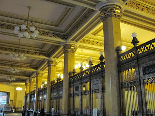
The teller windows; the bank is still working as an actual bank |
Upstairs area |
Elaborate stairs |
Baroquey or Roccocoy |
Her main concern was superficiality--that it shouldn't just be a façade of Mexican clichés and that it really had to mean something, and educate, which I couldn't agree more. So she had the idea that I should create a matrix of images, so that I might be able to form some sort of record of things repeated in the designs--how many words used, how big the images are, how the images are created, colors used, etc. I could then make my posters and have a reason behind why I made them that way; I could point to my matrix and say that I made the image take up 2/3 of the page because that was the way most of the designs were back then.
So that was absolutely fantastic, but it also means a LOT of work for me to do. She was so nice and helpful--she let us look at all the books in her office library, brought out a camera stand so I could take pictures, and then the next day she invited us to her house to take pictures of her personal library, which was just fantastic. She specializes in a lot older stuff--more like 1600-1850s, so a lot of the resources were older than I wanted, but she had the great point to make that if I learned the older stuff, then I would be able to see where the origins of stuff from "my" time period came from. It was very true, and I was able to see that almost immediately, in the use of borders and the text.
1600s |
late 1700s/early 1800s |
Her cat was very helpful in making sure to get in the way of the photos, and being paid attention to constantly. |
Dr. Marina's personal library |
My other advisor, Gabriel, had to cancel on me the next day, and rescheduled for 9:30pm the next day. I wasn't feeling entirely comfortable with that, but we ended up canceling anyway because his father passed away. :/ So hopefully I can talk to him through email before 11th week review, but he does seem to be very very very busy.
I also got a chance to visit the Frida Kahlo museum, which was about a twenty minute walk away from the apartment. It's in the house where she grew up, called the Blue House, very obviously because of its color. I was slightly disappointed with the museum itself--they didn't have a ton of Frida's large/famous works, and they had change the original placement of items in the rooms to be more staged; I was hoping it would be how they were originally.
My last tourist stop was to the Templo Mayor, which is the excavation of an Aztec temple that was found right in the heart of Mexico City. They thought it was underneath the Cathedral, but tunneling for the metro in the 1960s found it only a block away. Tons of cool stuff has been found there, and I felt like a lot of the aztec patterns and things made sense to me as far as the designs I've seen that were influenced by them.
I also got a chance to visit the Frida Kahlo museum, which was about a twenty minute walk away from the apartment. It's in the house where she grew up, called the Blue House, very obviously because of its color. I was slightly disappointed with the museum itself--they didn't have a ton of Frida's large/famous works, and they had change the original placement of items in the rooms to be more staged; I was hoping it would be how they were originally.
Inside wall in courtyard |
One of her last paintings |
Her staged artist desk with sketchbook |
One of many large paper maché creatures/skeletons |
The inner courtyard area |
My last tourist stop was to the Templo Mayor, which is the excavation of an Aztec temple that was found right in the heart of Mexico City. They thought it was underneath the Cathedral, but tunneling for the metro in the 1960s found it only a block away. Tons of cool stuff has been found there, and I felt like a lot of the aztec patterns and things made sense to me as far as the designs I've seen that were influenced by them.
Snake heads |
Giant snake guardian |
Frogs! |
The tunnel was built that destroyed a whole bunch o stuff. |
View of the cathedral from the Templo Mayor. |
Some color is still intact. |
Skull temple anybody? Apparently made from real human skulls with plaster over them. |
Stamps. |
Isn't she so pretty with her earrings? |
I'm not sure why they put little faces on them, but I thought it was hilarious. |
Actual colors used in the wall murals. |
Subscribe to:
Posts (Atom)